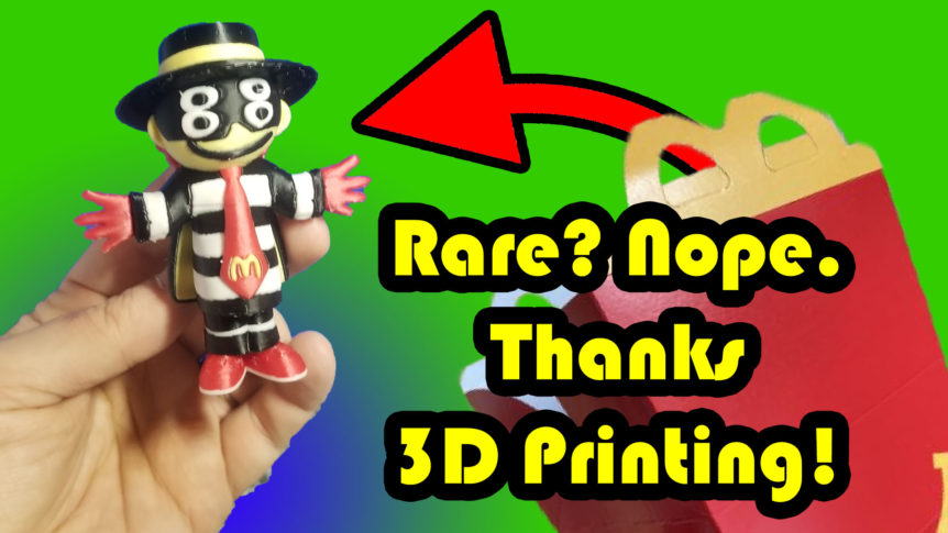
There was a whole section on this video about the stripes that I had to cut out for time. Otherwise this would have been a 40 minute video, and even with my current plan that just feels like too much right now. But modeling the stripes started out as me trying to wrap another mesh around the body, which didn’t work when things got alternative posed, and switched to using the displace to achieve the stripes. Not as hard edged as I would like, but it works. But all that was cut because I didn’t think people would want to see that much modeling. However, if retention during modeling is ridiculously high, that might have been a bad decision. But if this video does gang buster, I guess I have some bonus content to release.
The current zeitgeist in making youtube videos is to be manically entertaining. Quick cuts. Fast talking. Made for a zero attention span generation. But when I made this channel one thing that run in my ears was multiple people at the makerspace who said “You know, Joe. It’s kind fun just watching you work in Blender.” So on this channel I’m trying to lean into that and create a vibe that runs counter to the zeitgeist. If the common knowledge is to be more Sesame Street, I wanted to create a channel that was more Bob Ross. Does that make any sense?
But to insure that what hits the screen is relaxed, I am also trying to be chill and relaxed with my production. Just record the videos and throw them up. Well, that was the plan, but as things have gone on, I can’t escape a creeping amount of editing happening. I realize I am throwing things at the wall a bit, with longer, more rambling videos, time lapses to slow jazz, ASMR support removal, and a generally disunified collection of things happening. So while making the Grimace video, I had the idea of making a little intro detailing what viewers can expect up front. But I dismissed it at the time thinking “as long as I put time stamps in the, YouTube will give them that.” However, when I was editing this video I realized I did a terrible job of taking the viewer on the journey with me, jumping into action before I gave them any kind of introduction. So I went decided to implement the introduction I thought of and added 41 seconds to this video where I introduced the project and brought their attention to the timeline and time stamps with what they can expect.
Not sure if the Apple IIe aesthetic is something I’m going to go with in the future. I’m still feeling things out a bit. Though, what I might do is use the shorts version of this video in the intro instead of the fancy turnaround render I did. Though, that turn around was pretty cool.


