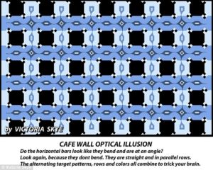
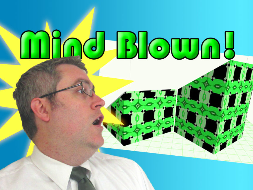
Functional and fun to look at. This has always been my mantra in designing for 3D printing since the beginning. Adding artistic elements to functional prints, like making desk card holder that has the last supper on it. But with the Davinci Color I feel like my opportunities for adding artistic elements to simple prints has skyrocketed.

How can so many things go wrong and still end up all right? First of all, the time lapse was recorded in 4K so I could get a free zoom. However, I had the camera too far back, so when I had to zoom in, the result looked grainy. I had recorded a voice over to go over the time lapse, but it sounded wooden and… just bad. But in the end I think the text is better and more engaging. I also recorded a segment showing how I did the modeling for this one in Blender, but it ended up being a boring 8 minutes long, so I scrapped it. I think this is me maturing as a content creator; being able to say something isn’t good and needs to go. But that’s why this video is basically 2 minutes long. And I might have had time to flesh it out and fix it if the video I was going to upload this week got kiaboshed when the filament supplier featured ran out of stock and asked that I delay release until mid next month. So I rushed the editing of this one, put it out as is. But at least I had a spare video to upload when that happened because I’ve been working on getting ahead.
In the end, I don’t have what I’ve got here. It’s simple, makes it point, and shows off something cool. But maybe I’ll up load those boring 8 minute tutorial as a separate video. So it’ll all be good.

