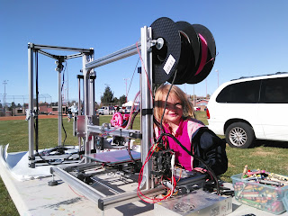
I have to apologize for missing my video last week. Lots of good things have been happening. For one, I attended another local event to advocate making and gather people’s information.
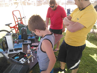 |
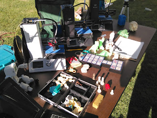
| My booth at Taste of Dixie |
More pictures of that to follow.
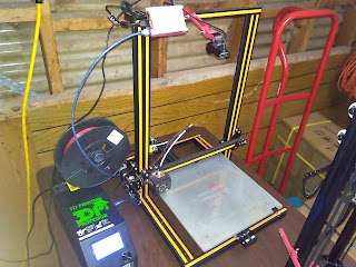
Additionally, I commissioned a local high school to use their vinyl cutter to make me some stickers of my logo. My plan is to brand my printers and, once I finish fixing them up and get octoprint running on them, then redistribute them.
That project itself was a heck of a job, but hopefully the next one will be easier.
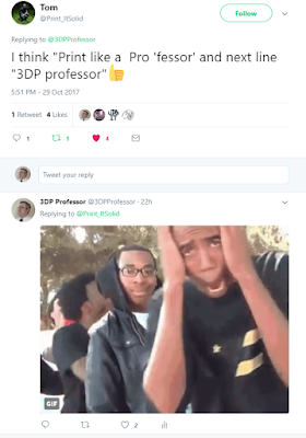
When I announced these stickers on Twitter I got a surprising response. People want them. This got me thinking, though, that for me the logo is sufficient, for a fan or customer I feel it needs a little more. Which led to a brilliant suggestion by tom @Print_It_Solid:
I’m playing with two variations of implementing this, and I need your help as to which one you prefer, text overlapping or not?
That’s the call to action here. Nestled way down here half way down the post where no one will find it. I could really do a better job with this sort of thing. Still, I need some help making a decision. Overlapping text or not?
And to insure this is properly buried, here’s the rest of the pictures from the Taste of Dixie.
 |
| My neighbor had a pink extruder, due to his daughter making him keep some pink on hand |
